ShopDreamUp AI ArtDreamUp
Deviation Actions


Suggested Deviants


Suggested Collections


You Might Like…


Featured in Groups


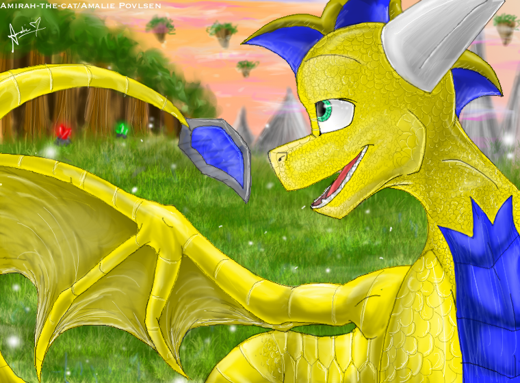
Description
Here is full detailed/more realistic commission, without bg for *Artomis  (Smile)")
But since he was kind of the first who requested a commission from me, I thought he deserve a bg on it ^^
This took time. I actually started on this 2-3 months back, but I got some other business too, so I only got Xale´s head details(scales and shadows) finnish, long time ago. But well I hope u like it.
I gotta go :3 And sorry, but I always make very messy bg´s...Sorry >_>
Only :devsartomis: may use this!!!! etc.
Xale©*Artomis
Art© Me/Amalie P/Atc
Image size
760x560px 763.14 KB
© 2010 - 2024 Art-by-Ling
Comments25
Join the community to add your comment. Already a deviant? Log In
First of all, I must say this is really my first crituique <img src="e.deviantart.net/emoticons/a/a…" width="19" height="19" alt="
I figured since it was a pic for me, I would give you one though. To start, I must say I'm amazed by your work yet again! Every pic I see from you, you're getting better and better at your artistic skill! ^_^
Now onto the pic, As for Xale himself, I have absolutely nothing to say about him. You drew him perfectly. His expression fits his personality so well, and I was surprised at how well done his head fins and chest were done! Color is perfect, wings are beautiful, and the tail *dies*
I love the BG as well, but this is where I see a few flaws. The things I really like about it is that you have the haze in the air, causing the blur for the distant islands and mountains. Perfect idea to have crystals and the sun setting, really sets the mood for the picture ^_^
For the negatives, the blur effect seems to hurt the picture as much as it helps. The closer grass (I believe, at least) should be more clear, but I know how that's really limited (and I'm not really one to talk since I can't even do BG's >_<) The other thing I notice instantly is the trees. The tops are fine (once again, a bit blurry closer up, though), but the bases are a bit funky with those lines running all up and down them, and the last tree on the right being a solid brown for the trunk makes it look a bit odd. Overall, these don't take away much from the effect of the picture, just things to be noted, I think.
Go ahead and kill me if you feel I am too picky <img src="e.deviantart.net/emoticons/a/a…" width="19" height="19" alt="
Once again, you're amazing, and now I'm off to hug this picture and die because of the epicness <img src="e.deviantart.net/emoticons/x/x…" width="15" height="15" alt="